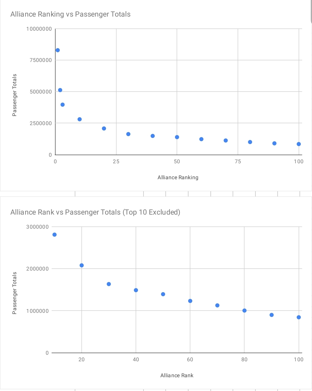
Just wanted to share a plot I created based on every 10th placement of the top 100 alliance ranking, with the top 3 rankings having their own plot. Two things to note:
1) The difference between ranks really staggers up once you reach the top 30
2)The top 3 alliances dwarf the remaining 97 alliances in terms of the staggering difference between their ranks. (The 3 leftmost points in the first graph are the top 3 alliances)
Now I'm sure plenty of reasons can be used to explain this graph, but I have no clue what they are. What is this data telling you?


