Welcome to Airport City!

AirportCityGame.com is the Number One place to be when it comes to the hit game Airport City!

Real time chat to other players, trade items together, complete space missions, form & arrange alliances and much much more. It's all here at AirportCityGame.com

Make Warehouse Numbers Readable

AKryztov

1000+ Star Club
Device
  1. Windows PC
Friend Code
2022ytz9
Username
AKryztov, Azure
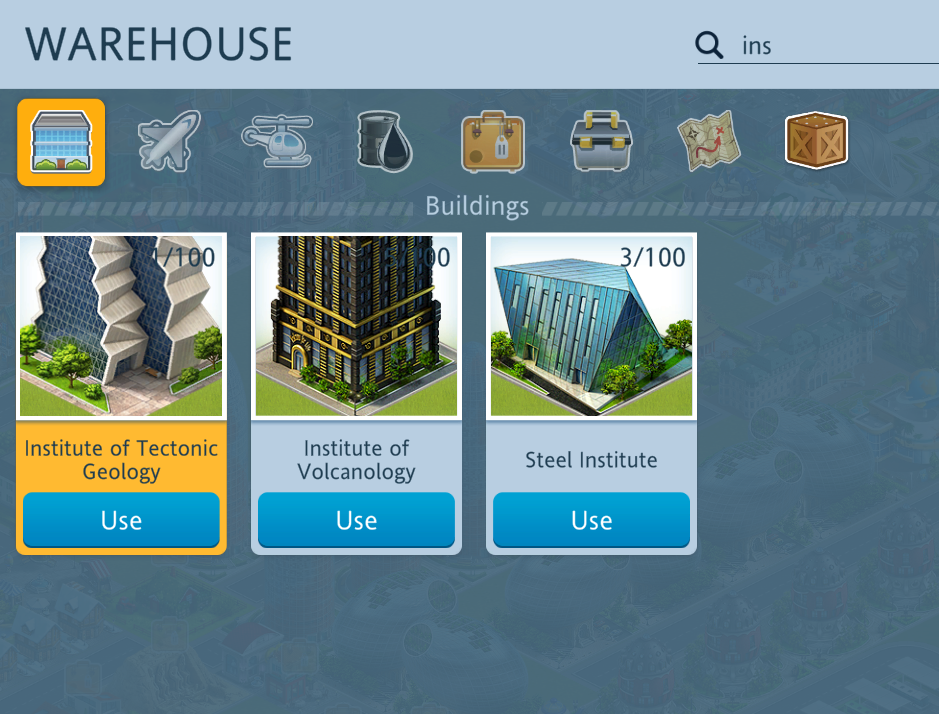
I don't know about the rest of you, but I find it almost impossible to read some of the Warehouse Amount Numbers (especially on the buildings).
Example:
Airport City 5_2_2020 11_25_52 (2).png


I have no idea how many Institutes of Volcanology I have.
 

Captain WH Rollins

150+ Star Club
VIP Flyer
Guide Writer
Wiki Editor
Device
  1. Windows PC
Username
Captain WH Rollins
I don't know about the rest of you, but I find it almost impossible to read some of the Warehouse Amount Numbers (especially on the buildings).
Example:
View attachment 31209

I have no idea how many Institutes of Volcanology I have.

Have a look in the Flight Collections - Institutes of Volcanology - the figure should be displayed.

Regards
Captain WH Rollins
 

AKryztov

1000+ Star Club
Device
  1. Windows PC
Friend Code
2022ytz9
Username
AKryztov, Azure
Have a look in the Flight Collections - Institutes of Volcanology - the figure should be displayed.

Regards
Captain WH Rollins
I tried that, but the collections numbers only tell you how many you have collected not how many you have. For example, I don't have any Spanish Eggs in the Warehouse, but the Collections number is 34.
 
I don't know about the rest of you, but I find it almost impossible to read some of the Warehouse Amount Numbers (especially on the buildings).
Example:
View attachment 31209

I have no idea how many Institutes of Volcanology I have.

In am in hearty agreement with you because I have similar problems with some of the numbers. It's actually worse because I have a visual impairment that makes it difficult to see fine details. I would think that the number should be surrounded by a white shadow to make it readable. It also be an interesting GUI effect.
 
In am in hearty agreement with you because I have similar problems with some of the numbers. It's actually worse because I have a visual impairment that makes it difficult to see fine details. I would think that the number should be surrounded by a white shadow to make it readable. It also be an interesting GUI effect.
Completely agree. I always have to do it in a cumbersome way. I take a snapshot and zoom it in. It works, but it’s not the quicker way to do it
And I have a feeling that it wasn’t so illegible some time ago. I remember something was mentioned about a font change...?
 
Top Bottom